


RIDER FEE BOOSTS
Role: Lead Product Designer
Over the past few weeks, I've been exploring how we surface 'fee boosts' to riders in the iOS and Android app. We typically boost riders' fee's during specific parts of the day when we need them most. For example, when it rains, more consumers order take away food, yet fewer riders want to deliver in the rain. Therefore, fee boosts are one way of us rewarding those riders for helping us deliver orders during those times.
The goal of this project is to explore how we can further optimise fee boosts to increase rider participation during peak times whilst reducing overall order costs.
Fee boost multipliers
One area that we focused on at the start of the project was how we define fee boosts for riders. In the past, we've rewarded riders for working during these times by giving them a flat fee bonus per order, i.e '£1 extra per order delivered during these times'. However, after speaking to riders we quickly discovered that this then favoured shorter distance orders over longer distance ones. As a rider, why would I deliver an order that takes 40 mins for the £1 bonus when I could deliver one that takes 20 mins? This created an issue where we saw an increased order rejection rate during these times.
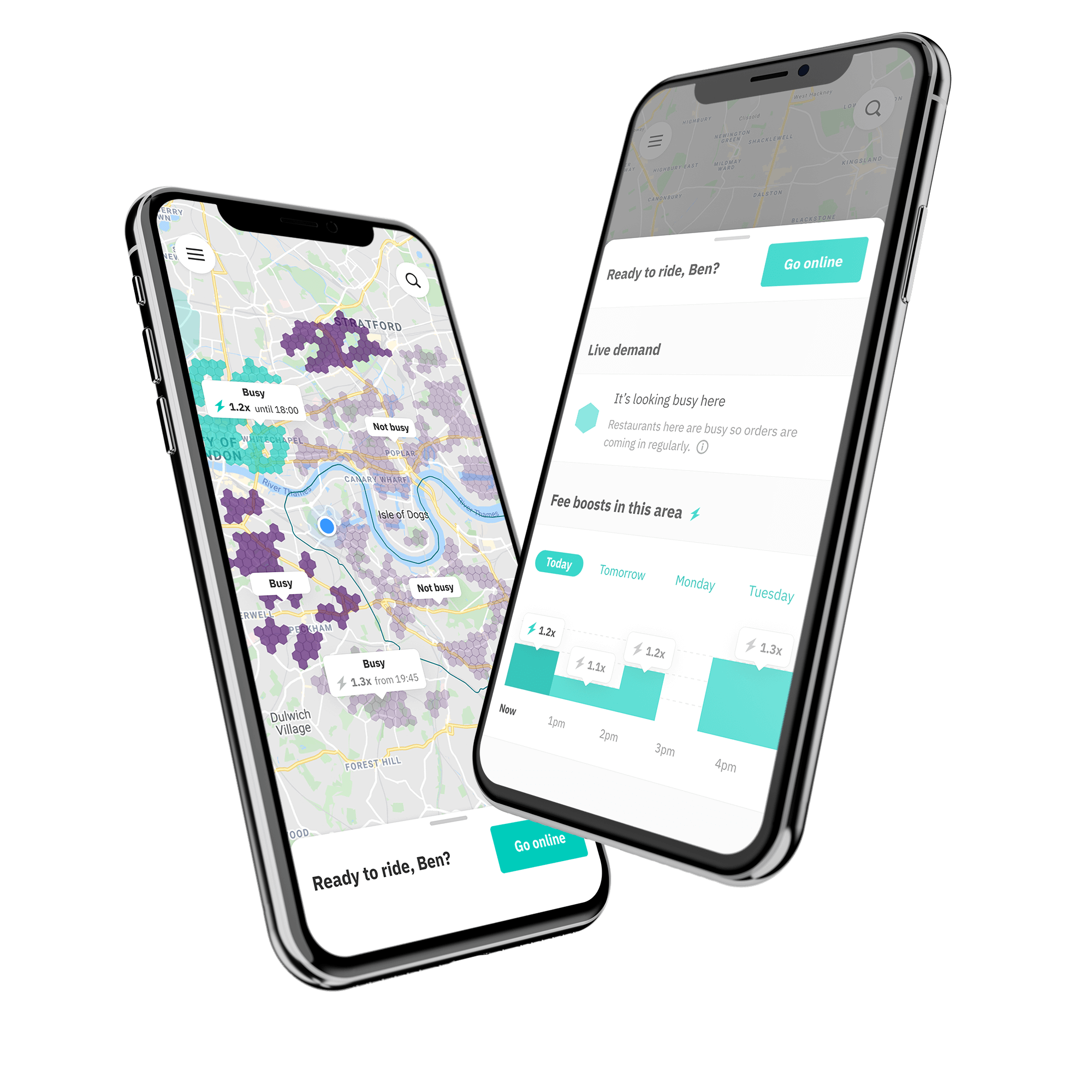
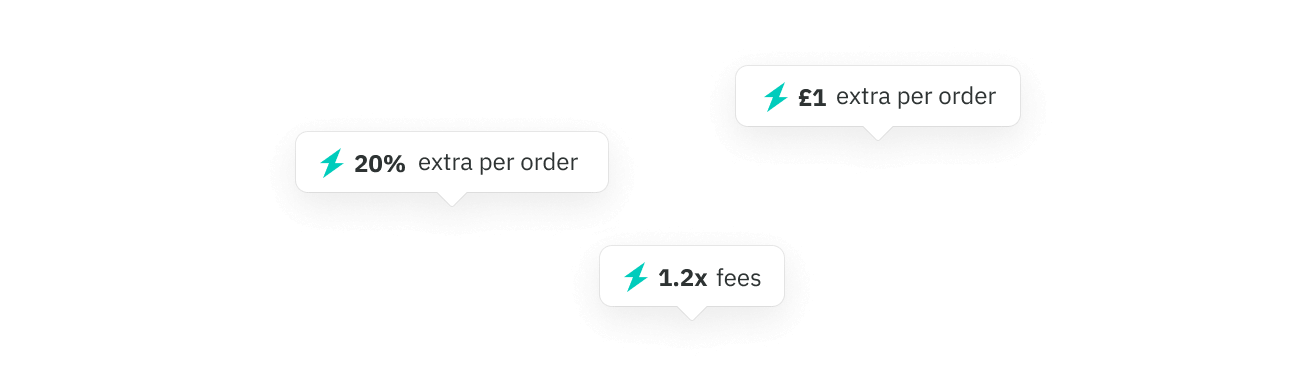
Therefore, we've introduced a multiplier boost, where riders are rewarded fairly based on the length of the order. Applying a 1.2x or 1.3x boost to an order will reward riders fairly across all order types.
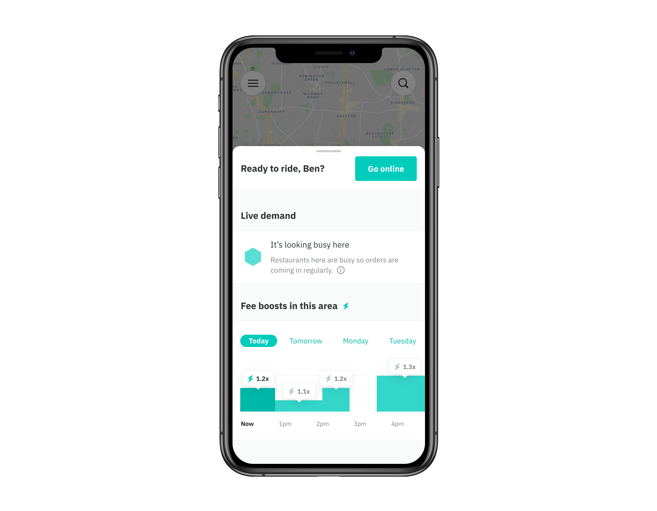
Increasing discoverability of upcoming boosts
Another discovery we made during user research was that our fee boost information is buried within the 'Planner' section of the app. This page is found in the hamburger menu and is bundled in with our old booking system, where riders can book the shifts they want to work over the week. We've since moved away from this operating model and riders no longer need to book shifts, so this fee boost information has become lost within the UI.
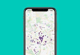
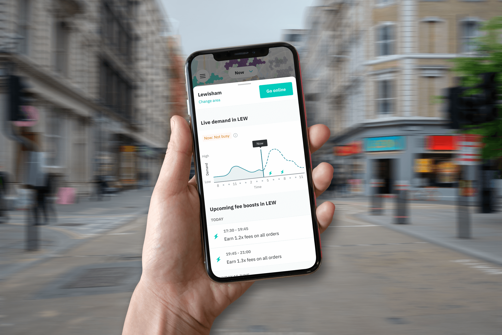
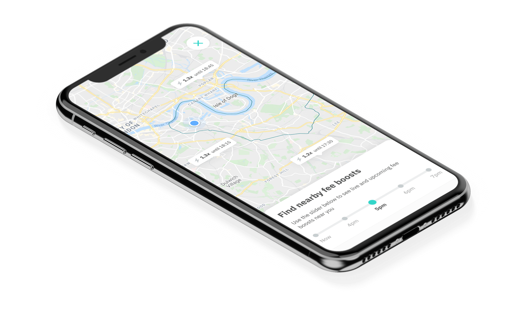
We have therefore moved fee boost info onto the map itself, which compliments our new demand heatmap. With all of this information displayed together in a central location, riders can make informed decisions about when and where to work.
Additionally, we have seen through previous experiments that informing riders of fee boosts further in advance improves their effectiveness, get's more riders on the road, and reduces our overall Cost Per Order, so it was important that we found a way to surface upcoming fee boosts on the map home screen.
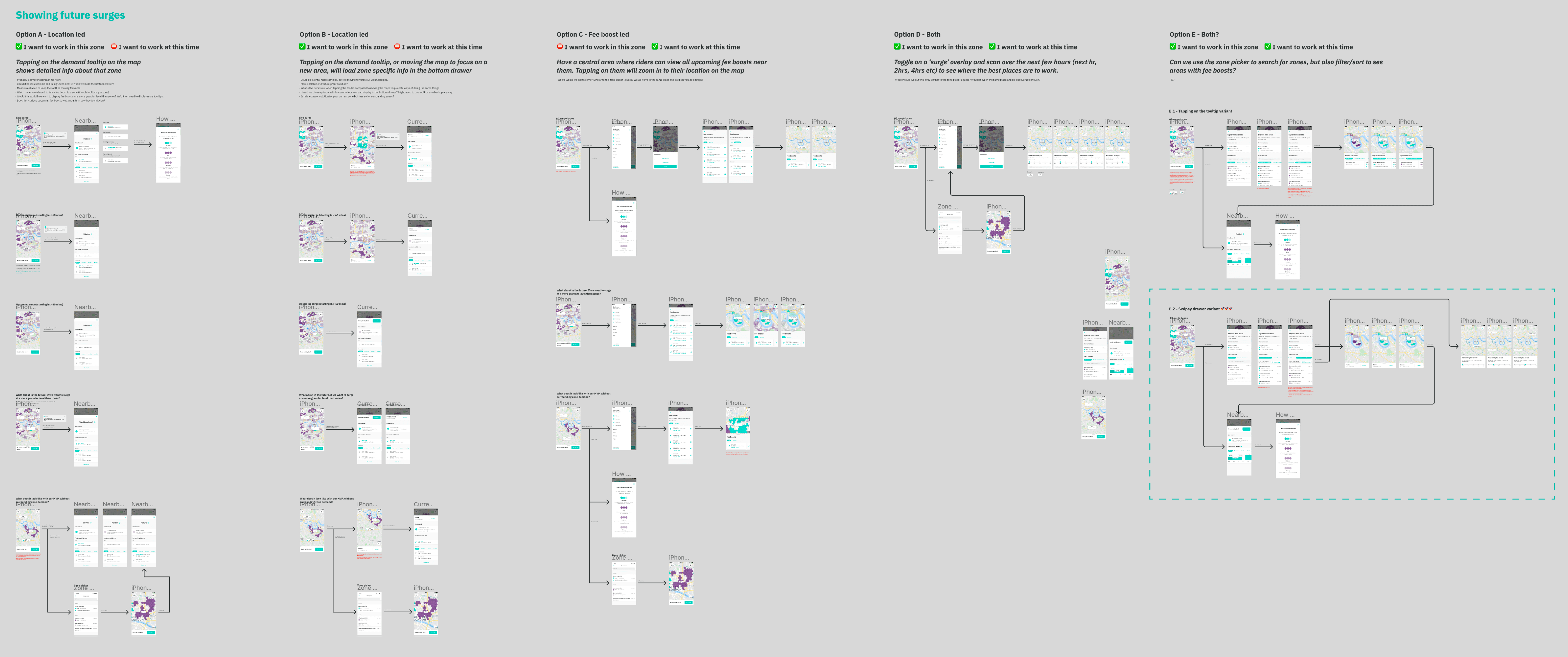
Location vs time
Encouraging riders to exhibit certain behaviours by using fee boosts can be analysed on 2 axis; time and location.
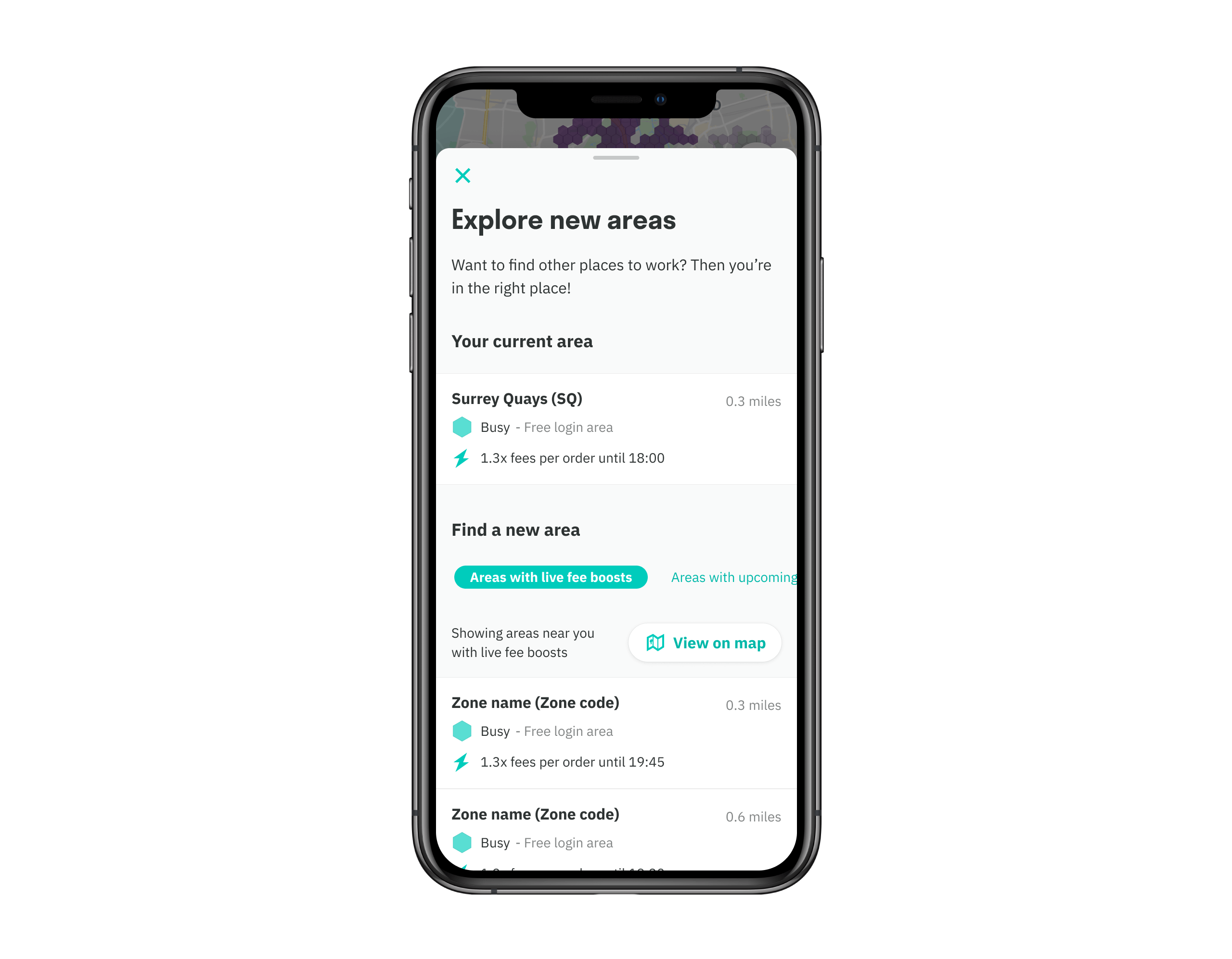
For some riders, their mindset is very much "I want to work during these times, so tell me the best places to work", and they're far more flexible about working in different locations. For others, they are unwilling to work in new, unfamiliar areas, and their mindset is "I want to work in this location, so tell me the best times to work here". Therefore, it was important that we designed a solution that works for all of our rider profiles.
So, we've explored 2 ways of surfacing demand info to riders. They can tap on the search icon to explore new areas, in an attempt to locate areas that are better than their current area by comparing demand and fee boosts. Or, they can swipe up the drawer from the bottom of the screen to reveal information specific to their current area, surfacing demand and upcoming fee boosts for the location they're in right now.
Here's some of the initial ideation work I did, exploring the two different ways of organising fee boosts; by location or by time, before deciding to group them together.
Creating a clear IA
As I needed to design for 2 mindsets and potential behaviour changes (encouraging riders to work in a different area or at a different time), it was important that the IA reflected information pertinent to each of those scenarios. I also needed to communicate this to stakeholders across the business who owned our fee boost platform and operating model, to reassure them that we're accommodating their needs in order to achieve the business goal of reducing rider experience time. This IA allowed me to step through each screen and demonstrate the purpose of the content along the experience.
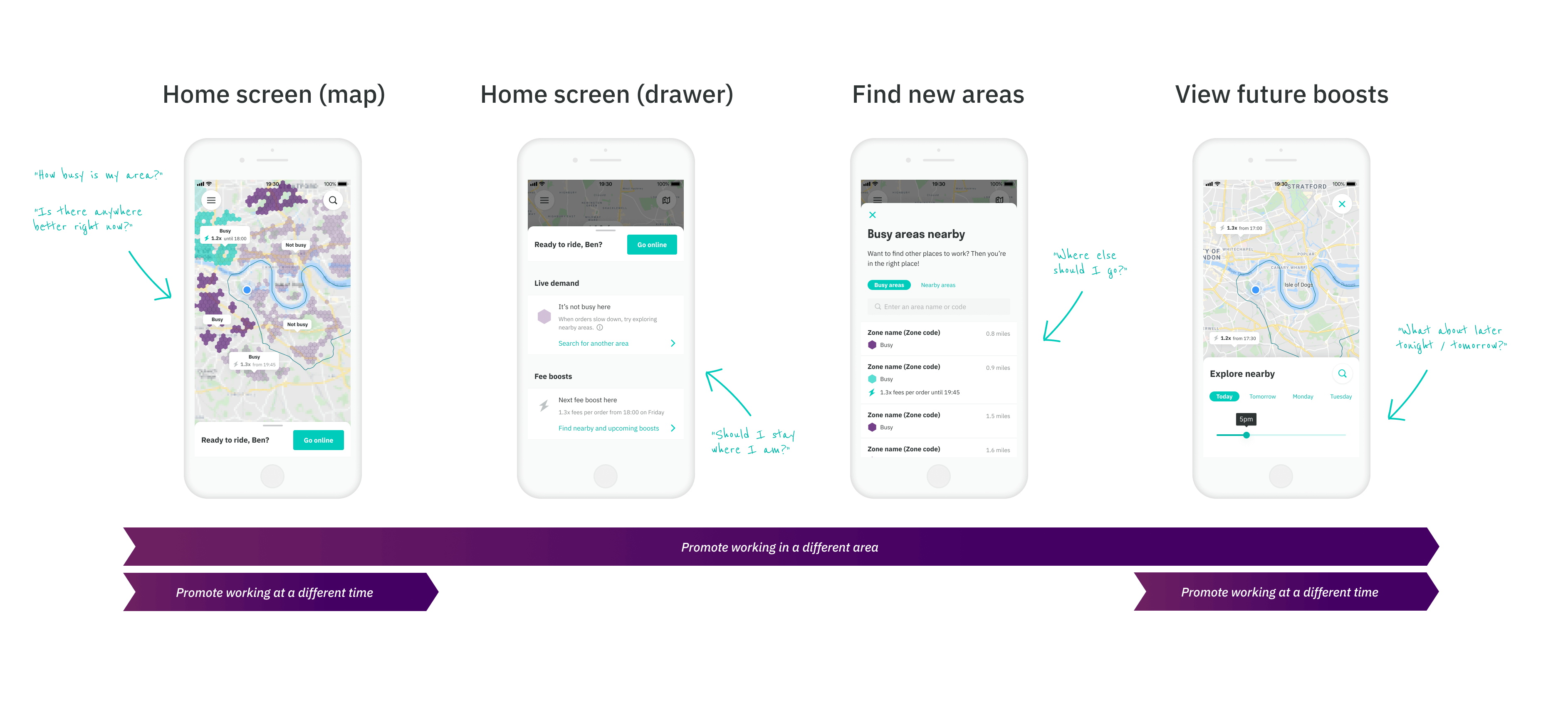
MVP IA
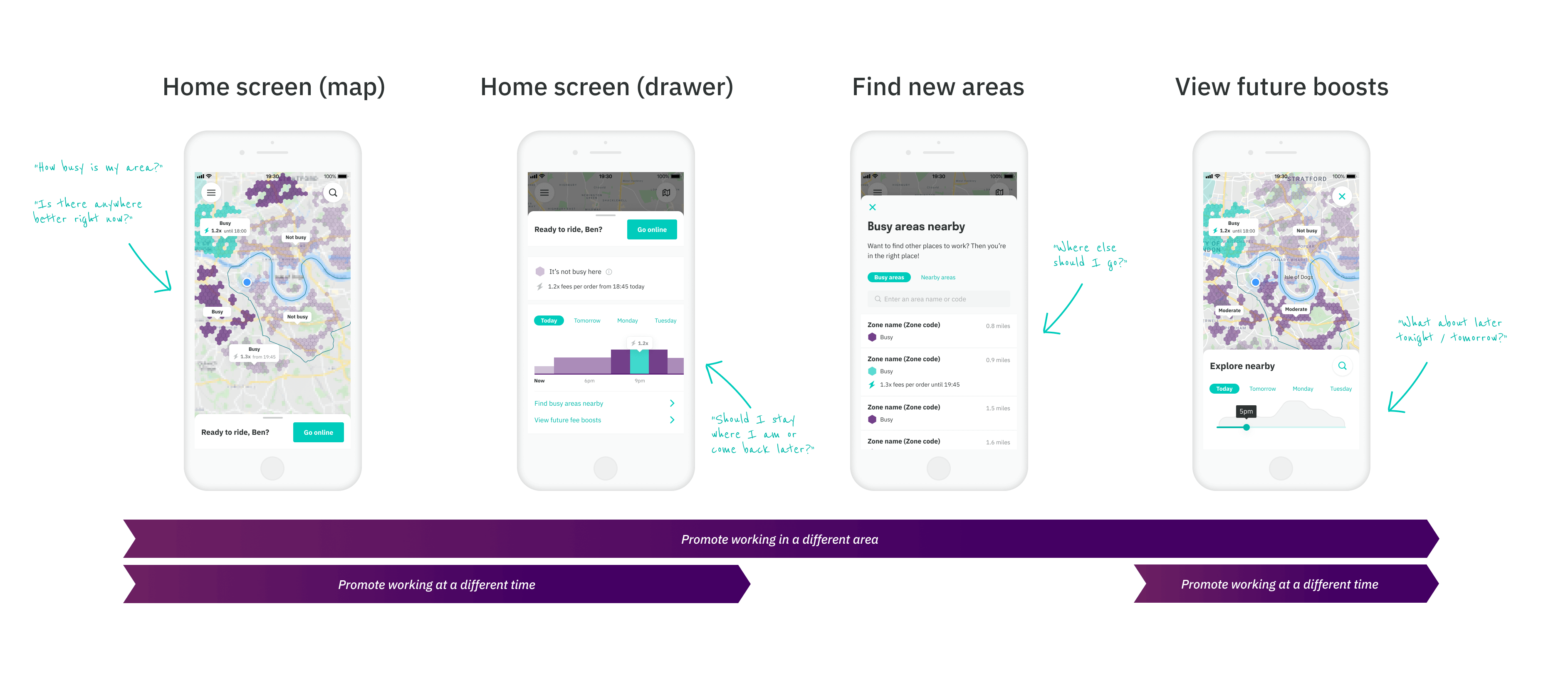
Vision IA
Here's a quick prototype I've created for usability testing
Feedback from usability testing
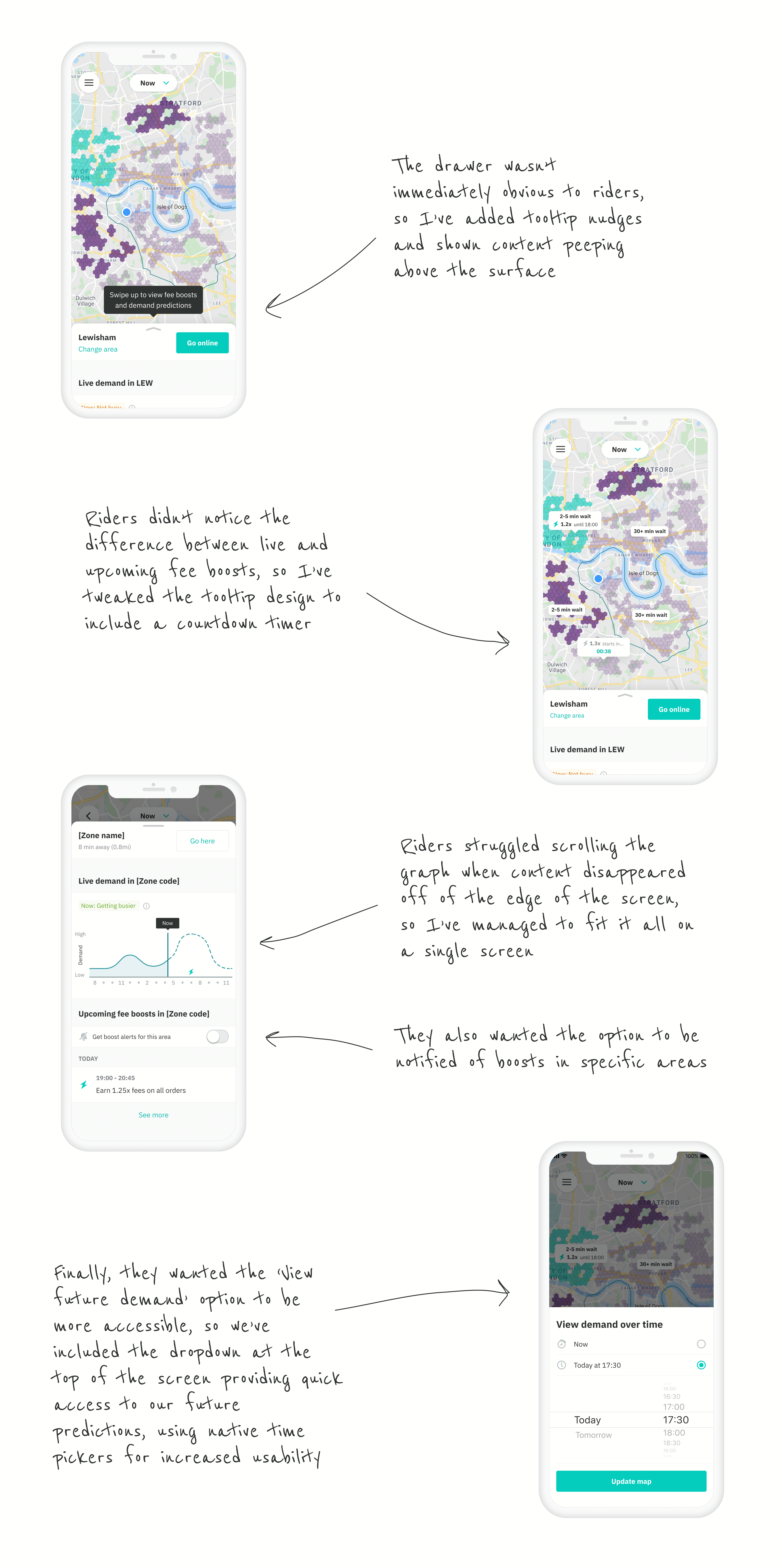
We ran remote, moderated usability testing with riders from the UK, Australia and Singapore to better understand how they'd interact with our fee boost concepts. We wanted to get qual feedback on the relative importance of the different features we've added whilst observing the usability and discoverability of the various pieces of information we've included, such as the demand graphs, future fee boost tooltips etc.
Below are our findings, and the iterations I've since worked on. We plan to take these into another round of usability testing in the coming days.
Next steps
Our next steps are to work closely with the logistics and algorithms team to help define how we can automate our fee boosts, to reduce costs and remove the need for an operations executive to manually create these surges. Can an algorithm reliably predict times where we'll need to pay extra to get riders on the road?
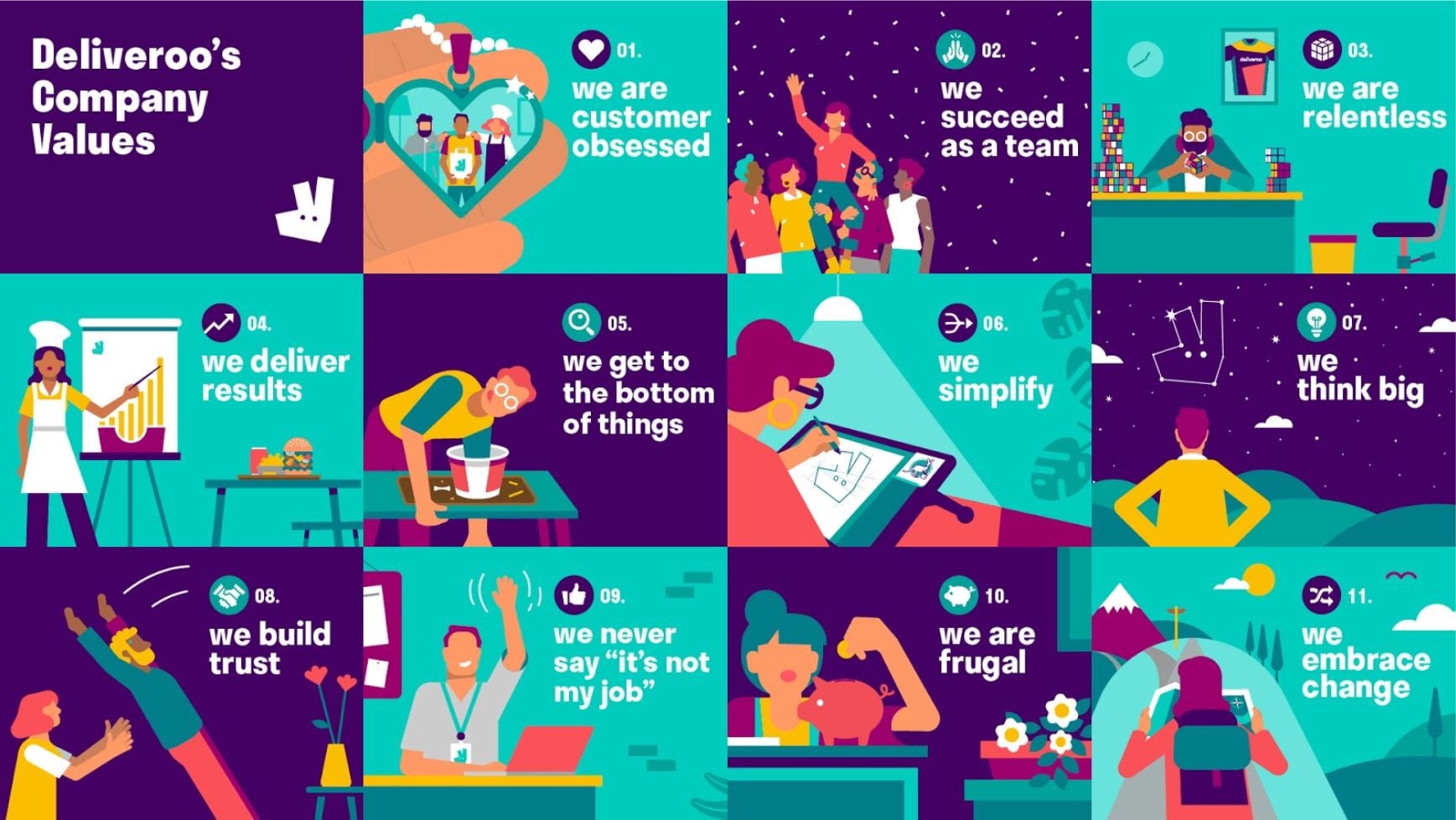
Throughout the project (like all projects at Deliveroo) we've worked hard to live and breathe our company values, in particular, 'Getting to the bottom of things', 'We're customer-obsessed', and 'We simplify'.