Archives for December 2014
By Graham Charlton
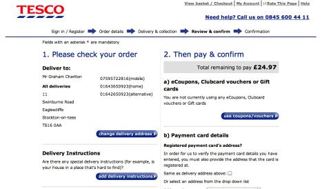
https://econsultancy.com/blog/6623-why-you-should-enclose-the-checkout-process
Reasons for enclosing the checkout
When reviewing e-commerce websites, one of the areas I always look at in whether retailers have isolated the checkout. This is the rationale behind it:
- By leaving out navigational elements, all unnecessary distractions are removed and this allows the shopper to focus purely on completing their purchase.
- Thanks to the removal of these distractions, information which gives the visitor confidence in their purchase is made more prominent, such as delivery details and customer service contact details.
- Security logos and messages are more visible, providing reassurances for the security-conscious shopper.
- It is made absolutely clear to visitors where they are within the checkout process and how many steps they have left to complete their purchase.
- Apart from the homepage link, customers can only head in one direction, towards the payment and order confirmation page.
BY IVANA MCCONNELL

http://blog.uxpin.com/6069/bad-ux-makes-users-blame/
"When things go wrong, we want to know why as quickly and easily (but maybe not truthfully) as possible. But when technology is thrown into the mix, the problems are more complex. Our perceptions change. When something goes wrong with a user interface, the questions don’t always have easy answers.
It’s the designer’s job to connect and empathize with the user, to teach them the language of design, to put MVPs in their hand, test, talk, and arrive at a solution.
Designers aren’t just there just to make digital products beautiful, but to make people feel good when they use them— especially when things go wrong. Let me explain a situation from my own life in which the design failed, but I ended up blaming myself instead of the website. "
Read more here: http://blog.uxpin.com/6069/bad-ux-makes-users-blame/
By Theresa Neil, Rich Malley
http://www.smashingmagazine.com/2014/04/22/rethinking-mobile-tutorials-which-patterns-really-work/

-
Rule Number 1: Use Less Text
-
Rule Number 2: No Frontloading
-
Rule Number 3: Make It Rewarding
-
Rule Number 4: Reinforce Learning Through Use
-
Rule Number 5: Listen To Your Users
http://www.smashingmagazine.com/2014/04/22/rethinking-mobile-tutorials-which-patterns-really-work/